
As you can see in the above diagram this sort of scheme doesn't limit you to either an hot or cold colour. You can plant both blue (cool) and purple (warm), or Turquoise (cool) and yellow (warm). This option can solve the problem of last weeks yellow, North facing small garden. The problem was that a small North facing garden would benefit from being made to feel larger warmer. The yellow would create warmth, but would also advance, being a warm colour, which would make the space seem smaller. Being able to play with shades, tints and tones here helps. I would pick a scheme of pale yellow, light oranges and peaches. All colours which are still next to each other on the wheel with additional white. Of course to try to cover all bases, last week I really did only look at strong colours. A monochrome scheme for the scenario would work just as well probably if you picked a lot of pale yellows with some strong accents. That would still count as monochrome.


Tints, tones and shades were something I didn't really cover last week. The diagram below covers it pretty well, but on the above colour wheel all the colours are at their most vibrant and pure. That is called the hue. A tint means the hue has had white added, so you get light pale colours. A tone is where grey has been added, you get a darker version of the colour, which is a little indistinct and misty. The shade is when black is added, getting a dark, sometimes muddy colour.

So you have pure vibrant hues, pale and light tints, misty tones and dark or muddy shades.
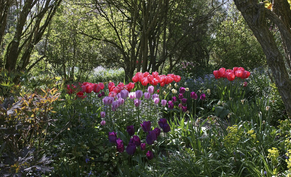
I may not use these terms correctly throughout these articles, because, well, despite being pedantic, I have better things to worry about. To use them correctly, I would end up using a great many more words than strictly necessary! In the above photo of the tulips in warm hues, you'll find that the yellow flowers are almost correctly a hue, perhaps they are a slight tint of yellow. The orangey-peach in the foreground is definitely a tint. The red tulips are a rich shade of red and the orange in the background is a tone. Not only is defining colours like that long winded, but also confusing. If I read 'a shade of red' I'd be left wondering 'what shade?' rather than going 'ooh, that means a dark red'. So, we'll carry on as before!
A note of the above tulip photo, isn't it beautiful? Almost text book Harmonious colour scheme right there.
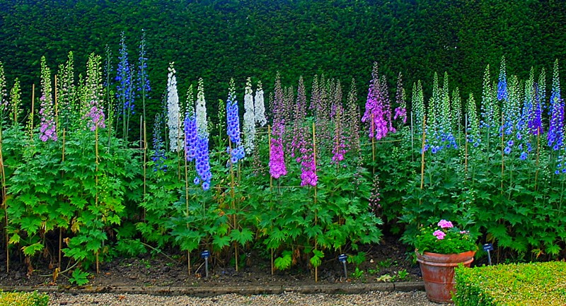
This scheme above has moved around the wheel a little. Going from red through purple into blue (see the tiny blue flowers in the background?) This image, like those above, mostly uses just one type of flower. This creates continuity through the different colours. You can enjoy the colour without needing to tackle different shapes and sizes of flower. This point is neither a negative one or positive one in reference to Harmonious colours. It's just a design feature of the garden that helps create an impression, much like a lawn of daffodils or a border of lavender. Repetition makes a bold statement, and here repetition of the tulips is very eye catching.

This border is the same but different. It uses a very similar scheme - blue through to purple and a little hint of red, yet unlike before this does not use repetition of flower type. It's a riot of species, shapes, heights and sizes. As you can see neither uses the colour palette better, each has its benefits, a woodland glade and a cottage garden border each has its place, and can each use a similar palette in a different, but effective way.
This image I almost left out. I have already covered repeated shapes with in the scheme, and also covered this particular palette. But I think it's a very striking border, and worth looking at just 'cos it's pretty!

Ah hah! Now this picture took an age to hunt down. You be wondering why? You may also be wondering why it's in an article about Harmonious colour schemes? You'll be thinking 'It's just got blue and a bit of purple.' And that, is true my friends, up to a point. Yet those are not the only flower colours in there. The reason it took so long to find a picture that met my requirements is because I was searching for 'Euphorbia and forget-me-nots' (and variations on the theme of blue flowers) and waiting until I found a picture that also had purple or yellow flowers. I felt that the first picture in this article was being unnecessarily harsh to the green side of the colour wheel. What with three greens to cater for, that's a large chunk of schemes that can't be used as green is always there, and therefore you tend not to count it in the scheme. Green flowers are kind of hard to come by, and let's face it, blend in when faced with the cacophony of other bright colours. Therefore the picture above illustrates how you can use green and create a, subtle yes, but distinct Harmonious palette. Lime green Euphorbia flowers, forget-me-nots, and the purple hints from Aquiligia and the other purple flowers in the foreground. Green, blue and purple. (Win!) Oh and top of that, isn't it beautiful?

This last picture leads me on to address the changing of the seasons. To reiterate what I said last week, I am not a professional gardener. I don't pretend to be, and that pretty much the point of this blog! Designing a garden for all seasons right off the bat isn't easy. So, with that in mind here is one example of a Harmonious colour palette in the autumn. (I have to admit defeat when I think about using the cooler side of the colour wheel in Autumn and Winter.) The red and yellow autumn leaves clearly work well together. Here, I'm going to cheat a little, the dying foliage to the right has taken on a lime green hue. Lime-green, yellow, and orangey-red. Perfectly Harmonious!
Come Winter proper you can fall back on the good old dog wood, Viburnum and Hamamelis, among others. Take a look here for other plants to build your scheme on in Winter.
So Will you be trying an Harmonious scheme? Any ideas how one could make a pink, purple, blue scheme work in Autumn and Winter!?
Tune in next week for Complementary schemes.
No comments:
Post a Comment