Welcome to "week 3". A little bit late I know! Well, I'm comfortable blaming Christmas for getting in the way. I hope you all had as beautiful a time as I did.
On to the colour! This week is Complementary week.
This is the colour scheme that your probably most familiar with. This is the scheme behind Christmas's red and green. It's the blue and orange of the Firefox logo! It's the yellow and purple of
Wario's outfit! And, although I say your probably most familiar with it, you actually dont see it about all that much in every day things.
The reasoning behind this is simple. The Complementary just means two colours which are opposite on the colour wheel. The easiest to spot are the primary colours and their opposite as illustrated in the above picture. In my head, when I read Complementary, I actually think contrasting. The colours work in a way (especially if you get the pure hues of the colour wheel) that when placed next to each other they seem to make each colour brighter. They pop and sizzle. This effect is one that we don't generally want to see all the time. But it is a great device for getting something noticed, and it enhances the effect of each individual colour.
Because of the difficulties in the garden of pinpointing one colour (primary blue say, rather than greeny-blue or purpley-blue,) I think it best to look at these schemes in block colours. All the blue spectrum vs all the oranges that are out there. Ditto for the purple vs yellow combo. I'm not sure how to address the green/red Complementary scheme. It is going to look astoundingly similar to the monochromatic red theme from week 1! With this in mind though you can start to appreciate that in fact the Complementary scheme in a garden does not have to have that eye watering effect, because you can have muted yellows against bright blues, and everything will be interspersed with green in any case!

This is a lovely example of a purple/yellow scheme using tints of the colour (tints are a pure colour (hue) with white added.) The purple is faded, almost wondering off in to white with some of the plants used. The lovely pale yellow rose mirrors this faded look. This is an example of a like for like scheme working well. The colours play off each other and enhance each other, but because the colours are so pale, its a delicate look that is created.
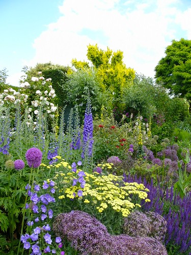
Asides from the naughty patch of red, this scheme uses the same colours but with much stronger purples. The deep purple on the right plays off well against the light yellow. It seems to make the purple darker. On the left hand side, the paler purples seem to make that light yellow even lighter! The great use of shape in this border, of spheres and spikes draws your eye to the back, and the dark yellow spikes almost hidden there. And, then even further back in to the depths where another wave of purple lurks. This is a brilliantly framed border with blocks and undulations of different textures, all (well mostly) using the same two colours. Inspiring use of the Complementary.
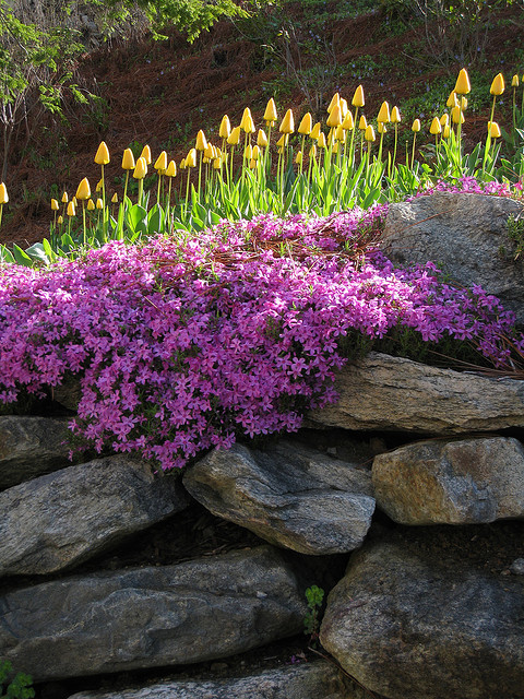
This example above is another use of the purple/yellow scheme that really speaks to me. I am learning that I actually love block colour, bold lines and contrasting textures. This display has it all. A mass of purple flowers and then a spiky crown of bright clean yellow tulips. I'll admit that the photographer caught a sublime moment of the sun hitting this little patch, but the colour works so well. I could stare at this picture for hours.
Another meandering border of yellow and purple. Simple block planting here. The use of the Complementary colours here makes the garden feel really alive and lush despite the feeling that this is the height of a hot dry summer, but perhaps that's just something to do with the quality of light!
Blue and orange! The line is fine in a garden between this scheme and the previous one. This scheme uses the blue and orange mixed thoroughly together, yet the blue has a hazy fluffy quality, whereas the orange pops with its little round flower heads poking through everywhere. The mix of these textures works really well because of the colours used.
Wow! Bit different huh? I was actually finding it hard to find interesting examples of blue and orange gardens. And then I found this! Up until now I have been ignoring anything in the garden but the planting really. When when I saw this, I felt the error of my ways. The blue wall, orange container and matching planting is totally and utterly perfect. That warm blue works so well against the hot orange, and each colour sizzles and seems to get hotter. Great focal point and use of colour.
Once I found the previous picture, I got to thinking about the use of colour in the garden in the form of sculptures. This fascinating sculpture above - (it must be 2D, but has been made to look 3D. Very clever and good fun too!) - it a great example of using Complementary colour in a garden without thinking about planting.
Sculpture has shown me the way too, when it comes to the most challenging Complementary scheme - red/green. These two glass sculptures (above picture and below) are wonderful examples of art in the garden to highlight green as a colour separate to the general greenery. The more elaborate piece below also uses lime green, against the more leafy greens surrounding it, which again focuses your attention on the contrast of it against that eye-wateringly bright red.
So there you have it. A small selection of Complementary schemes used in the garden. Which is your favourite? Would you consider using one of these themes yourself? Perhaps paint all the wood, pots and walls orange and have only blue planting? This concept can be surprisingly soft, and doesn't need to leave you on edge. It would be great for any space, often creating neither a hot nor cold feeling, or enclosing or enlarging a space either!
I haven't decided on the theme for next week yet! Keep an eye out for week 4: the mystery week.


